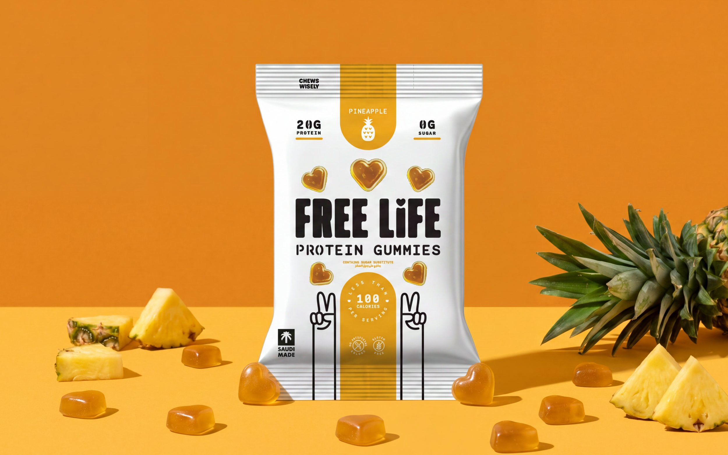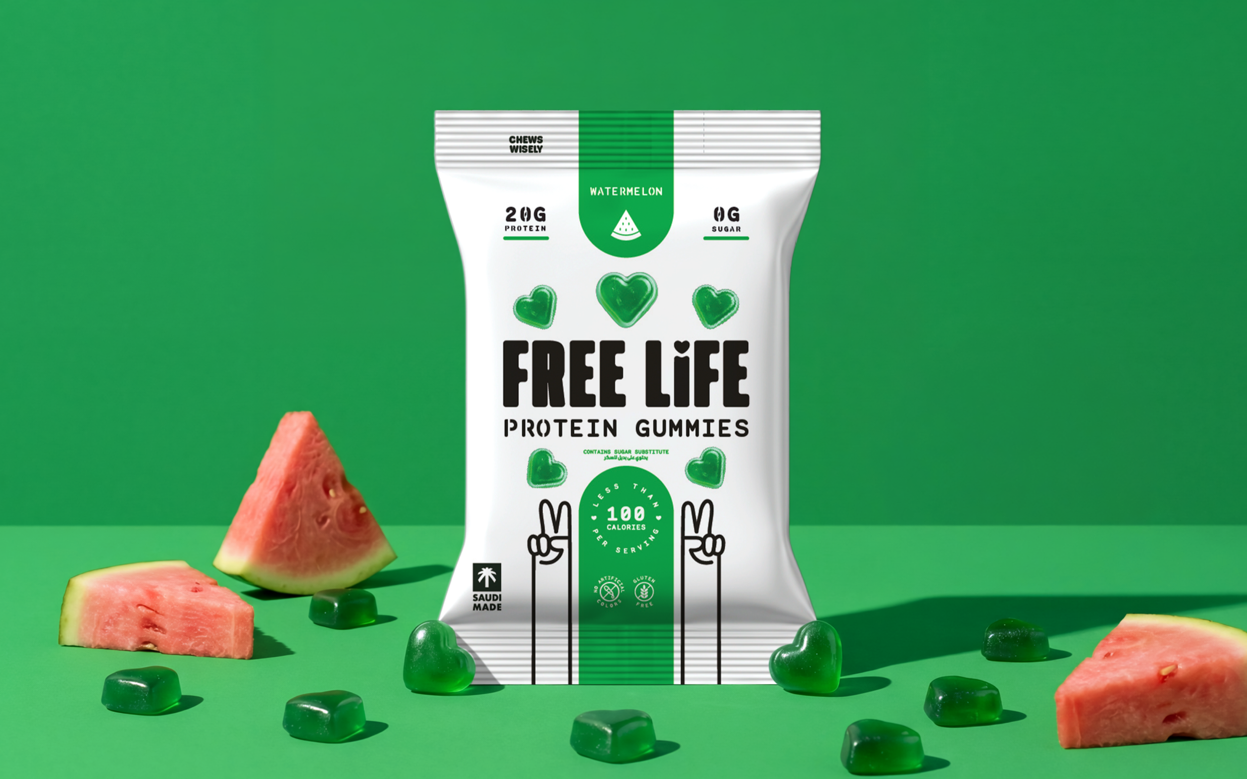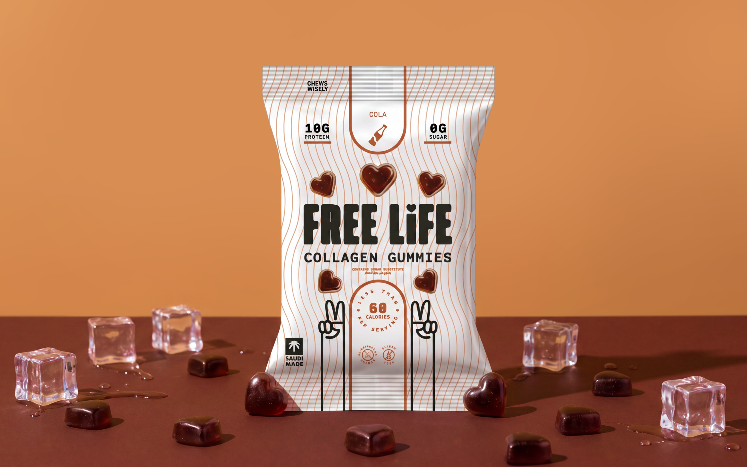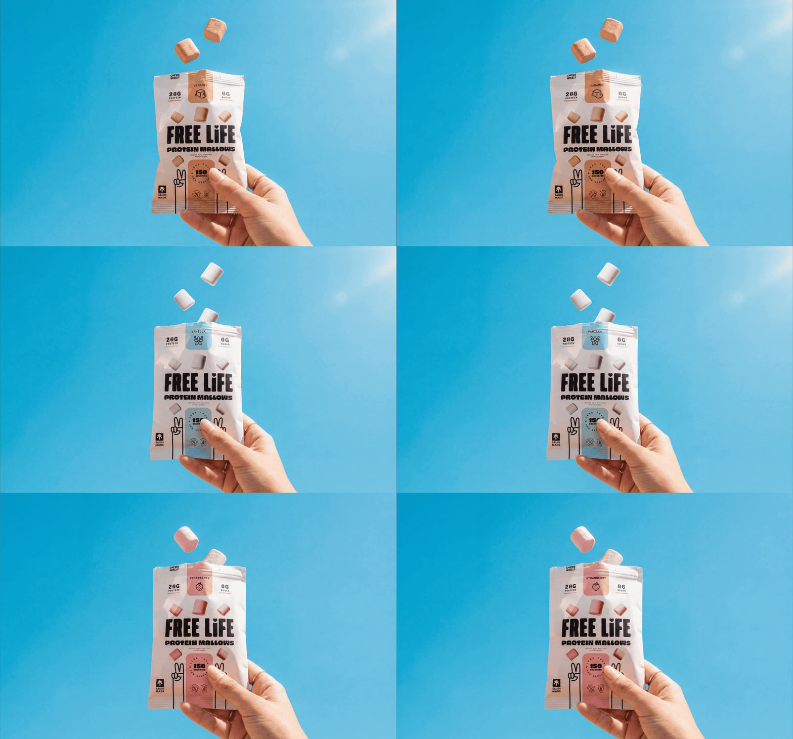
FreeLife had developed a genuinely innovative new product range.
In a category crowded with lookalike wellness brands, they needed an identity with more power, more personality and a lot more shelf presence.
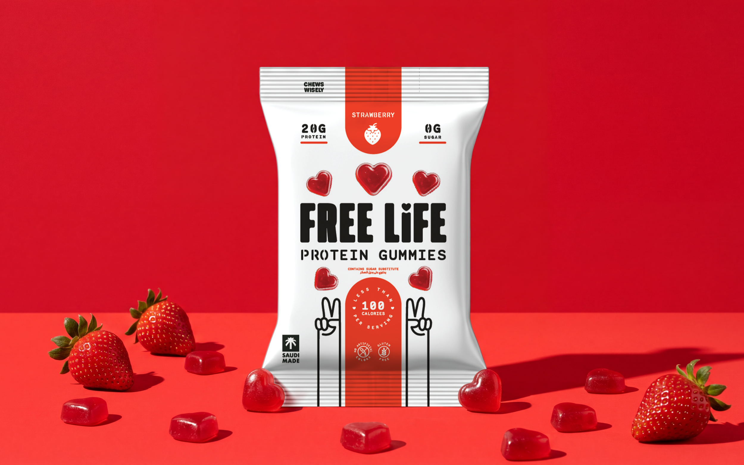
As the range expanded, the identity had to become more distinctive, more flexible and much easier to recognise on shelf.
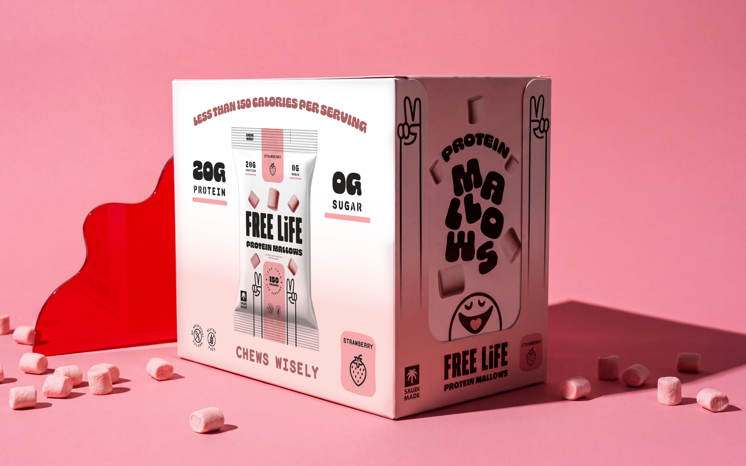
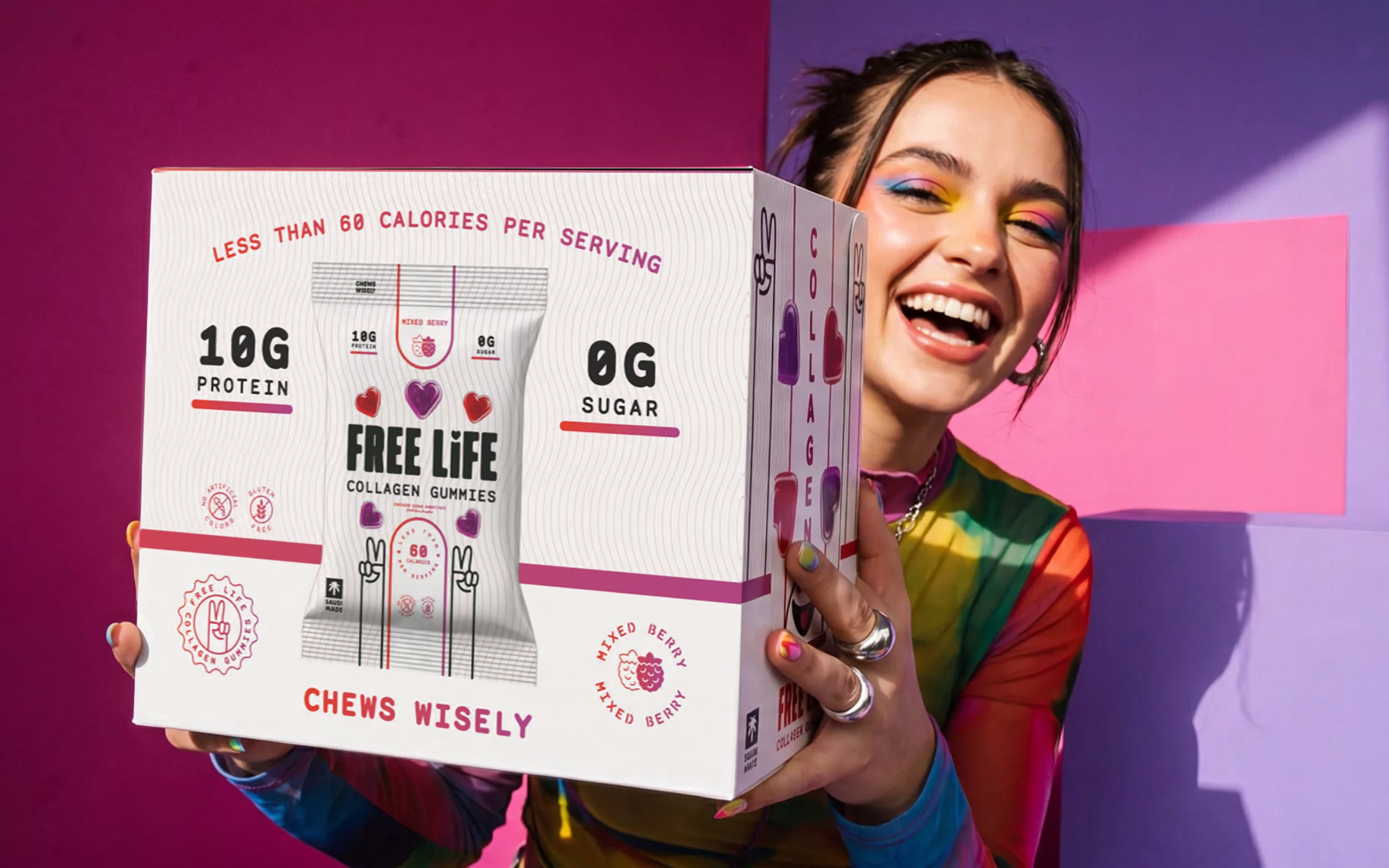
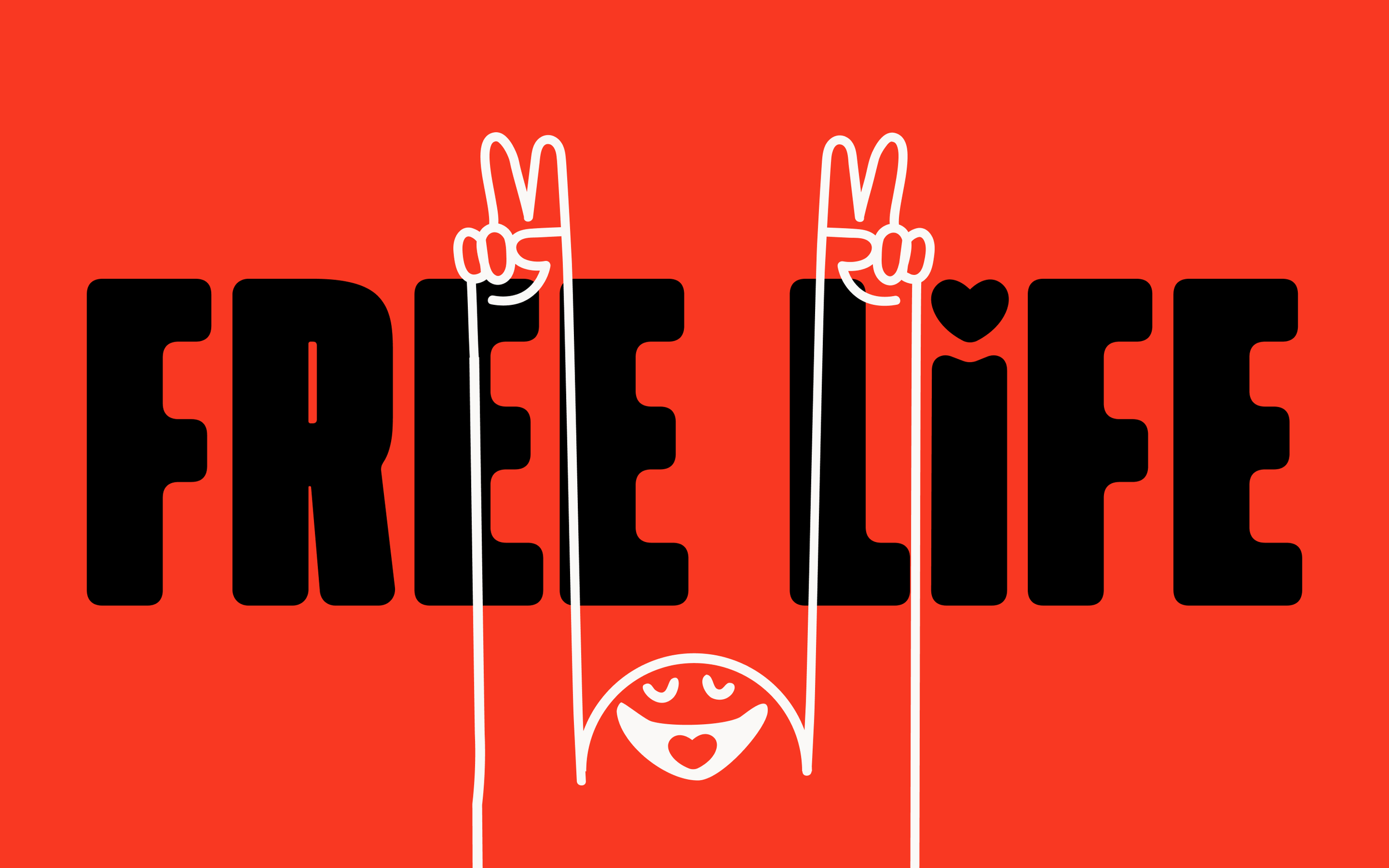
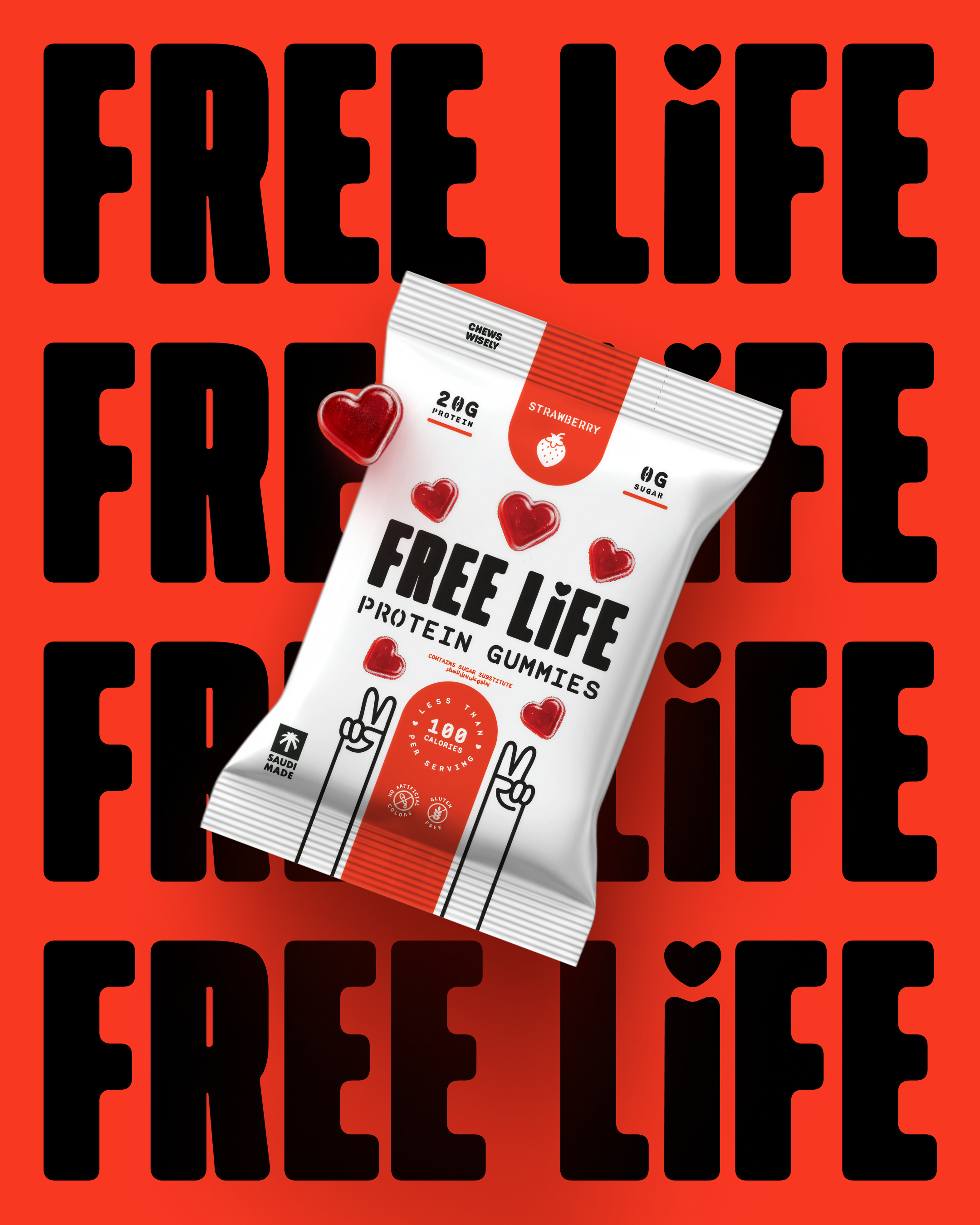
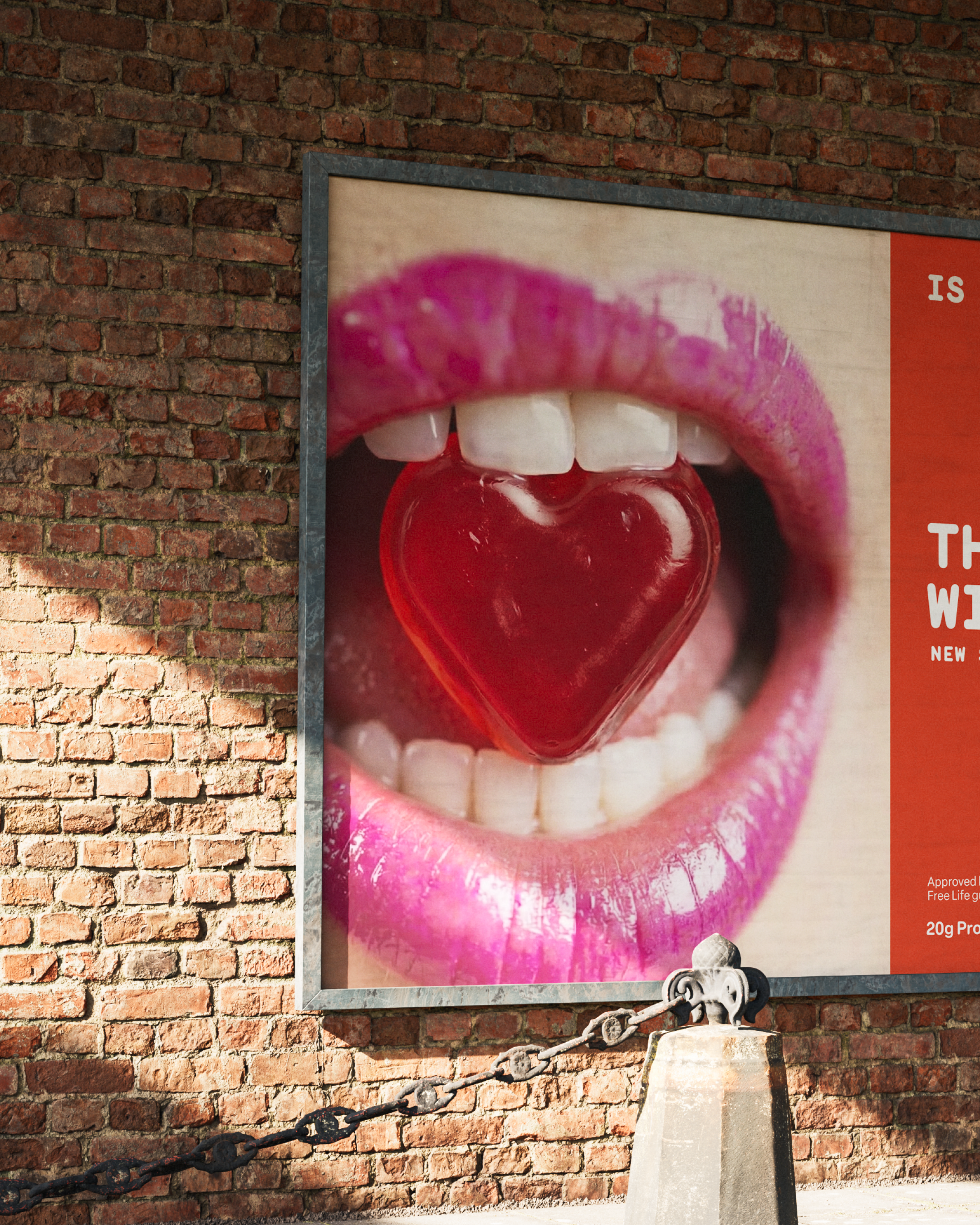
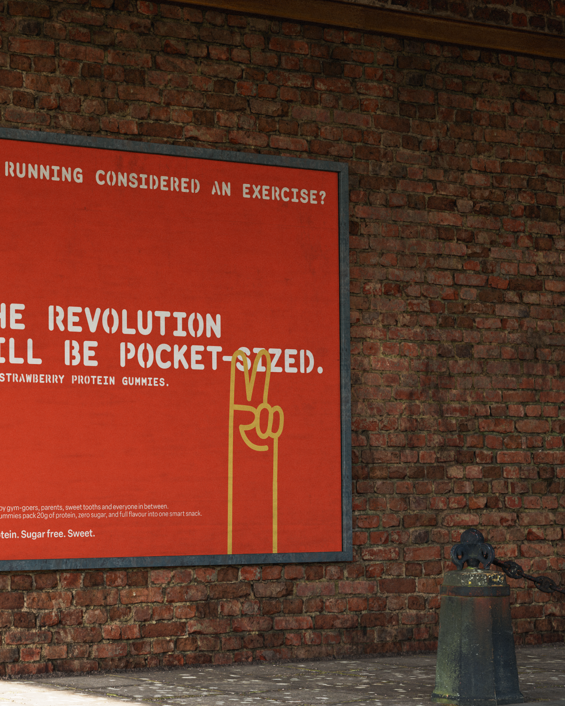
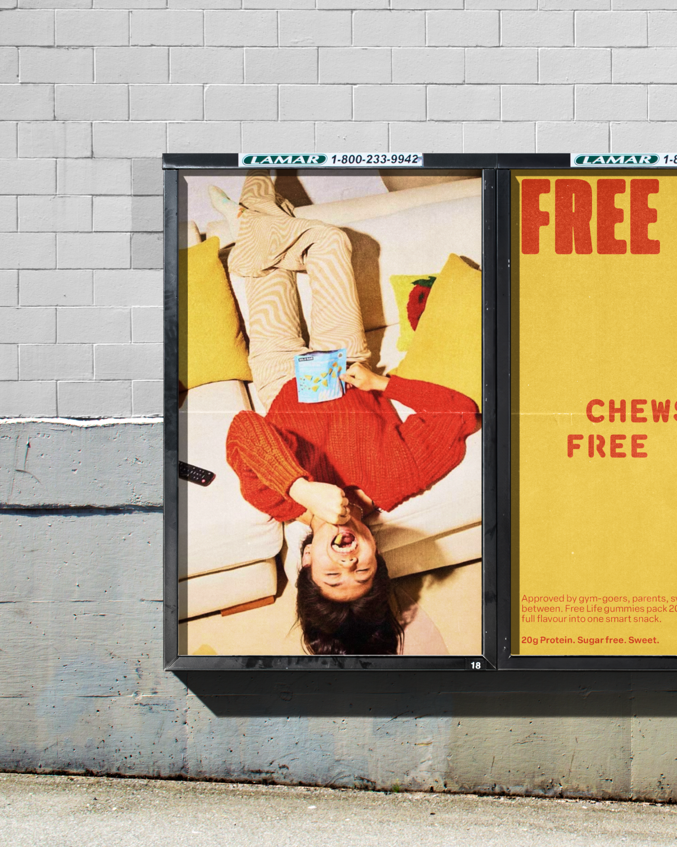
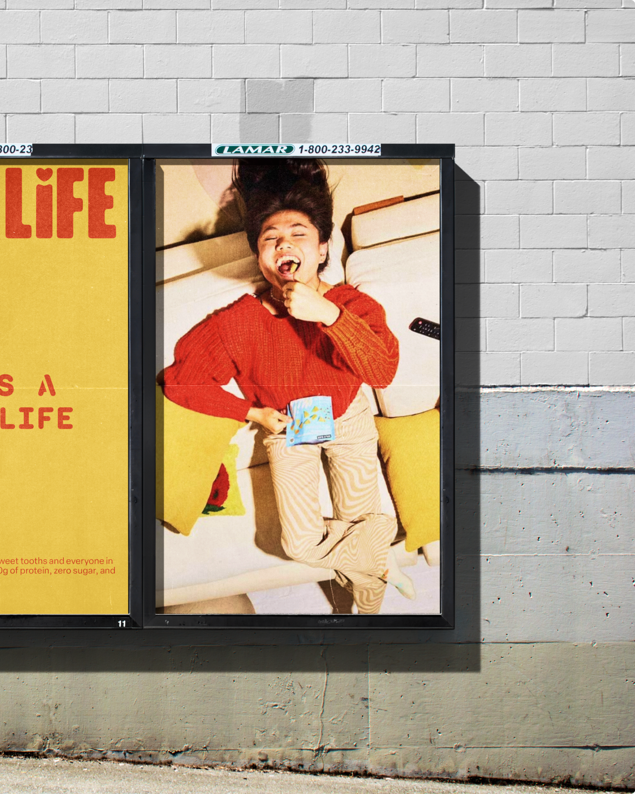
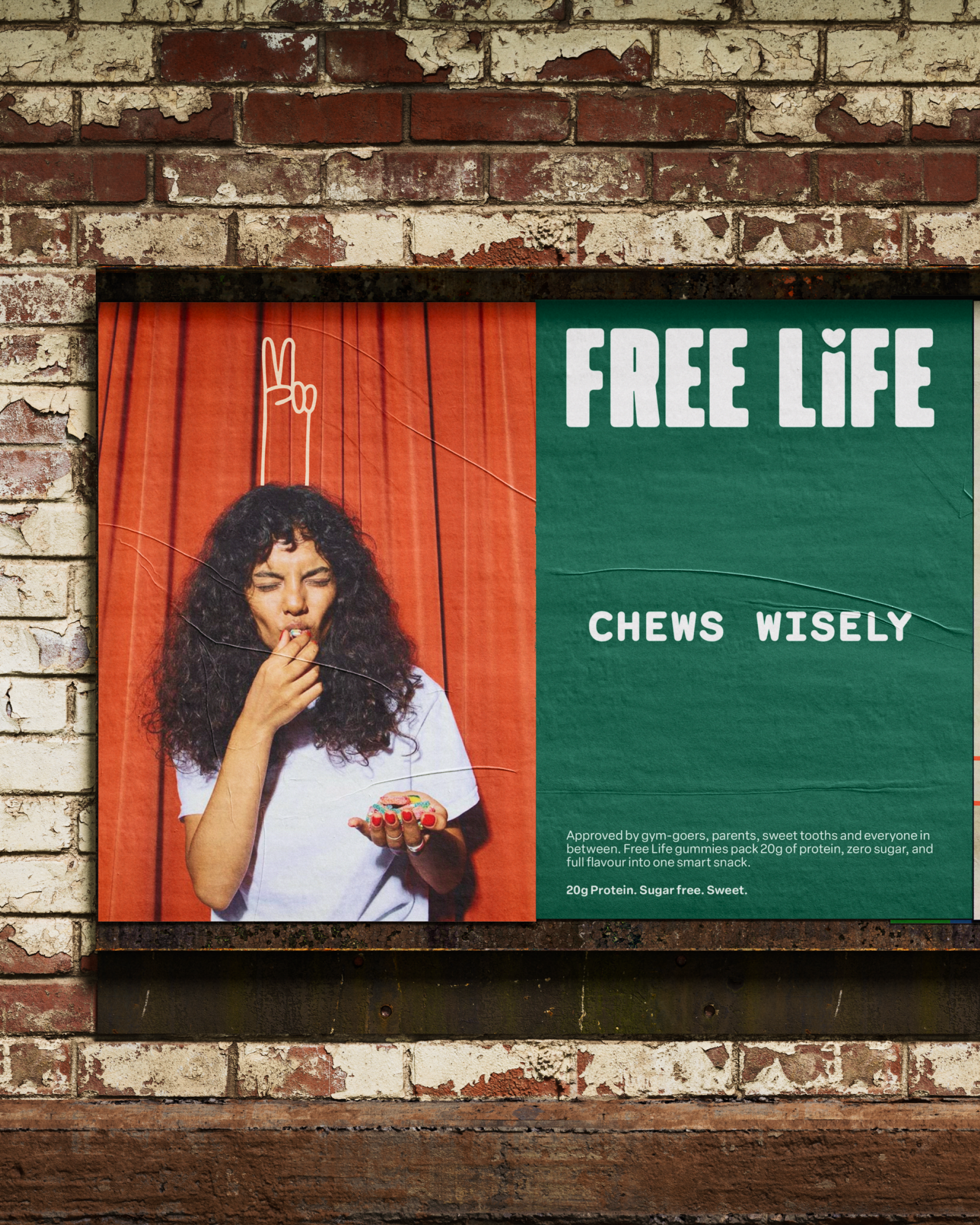
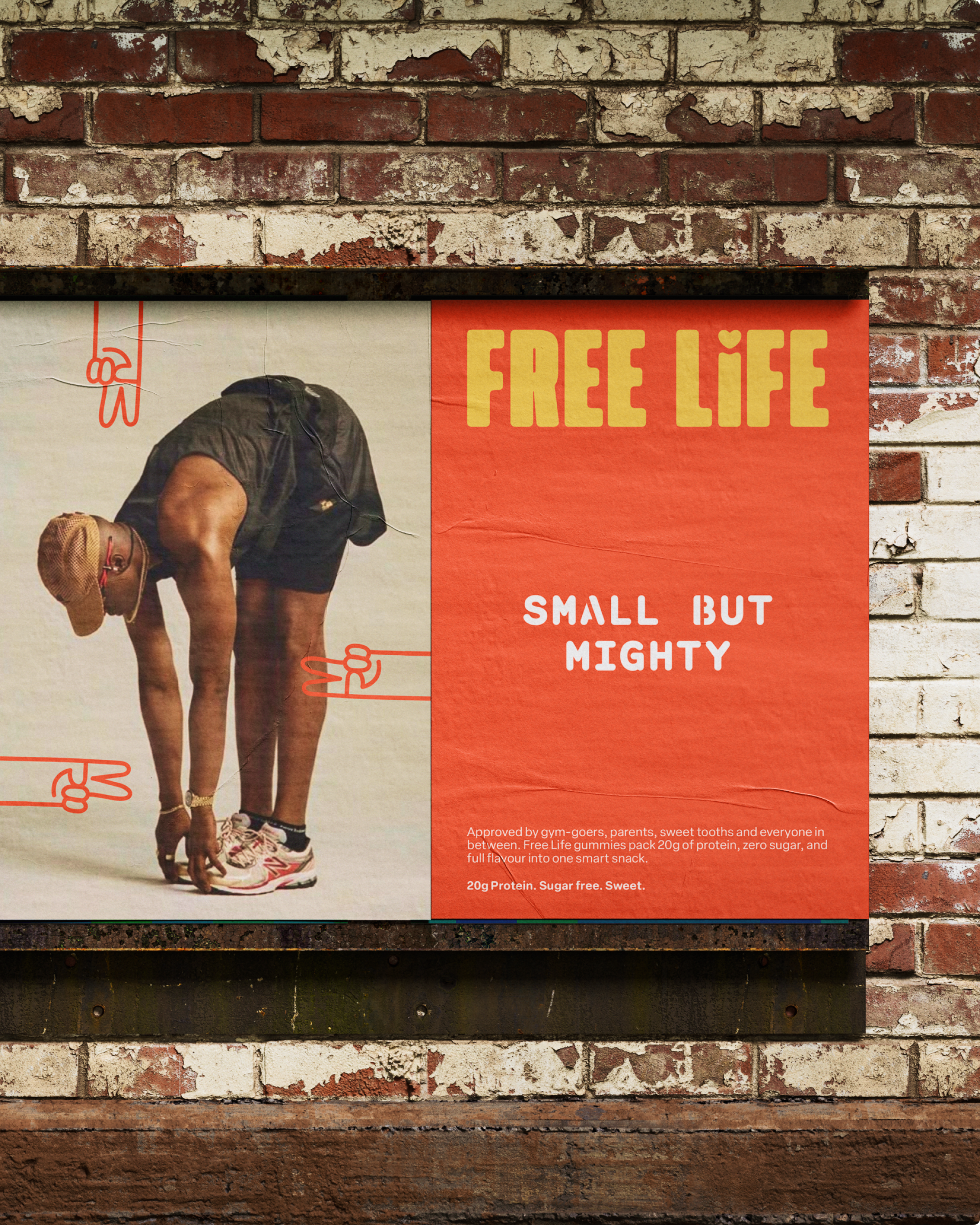
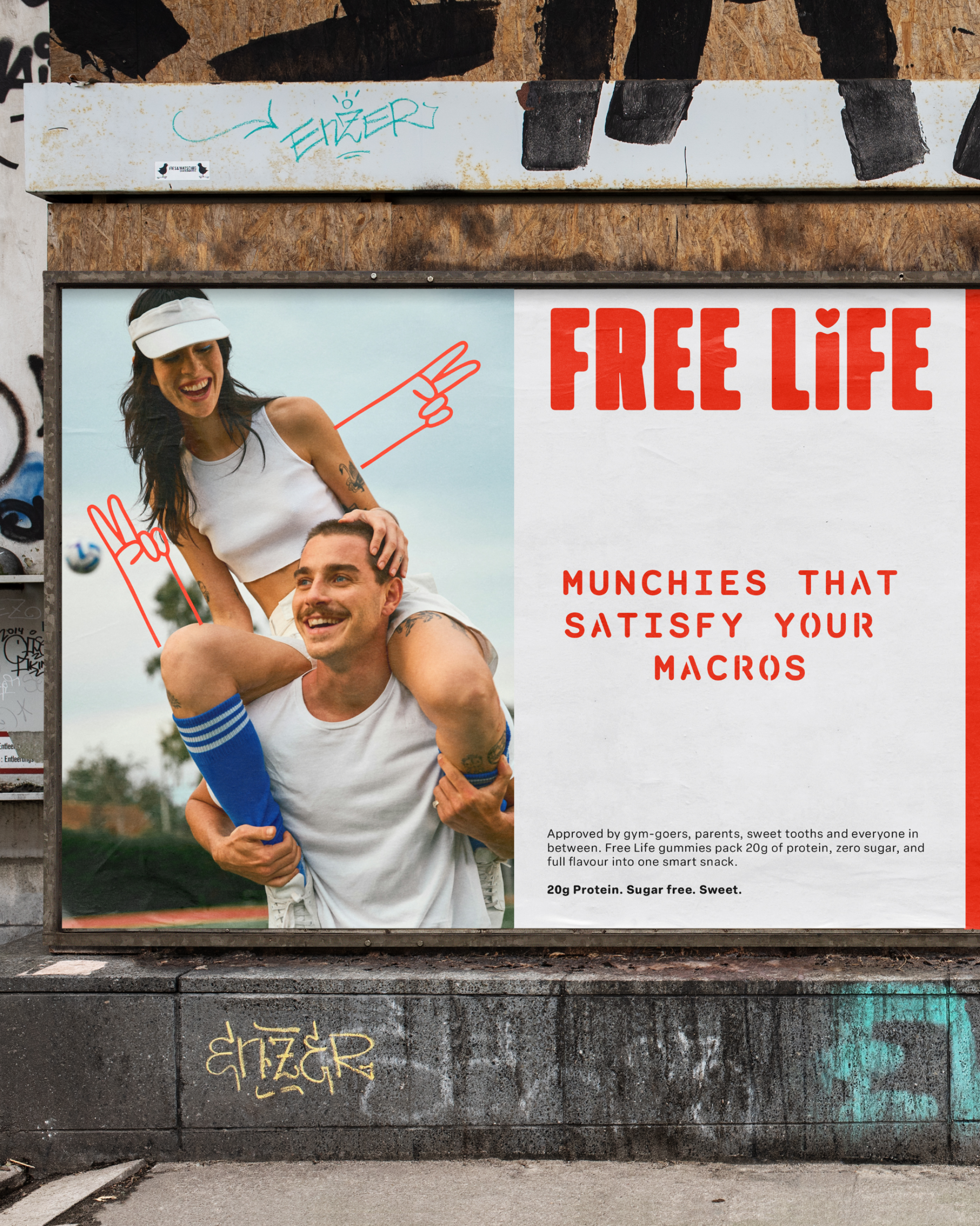
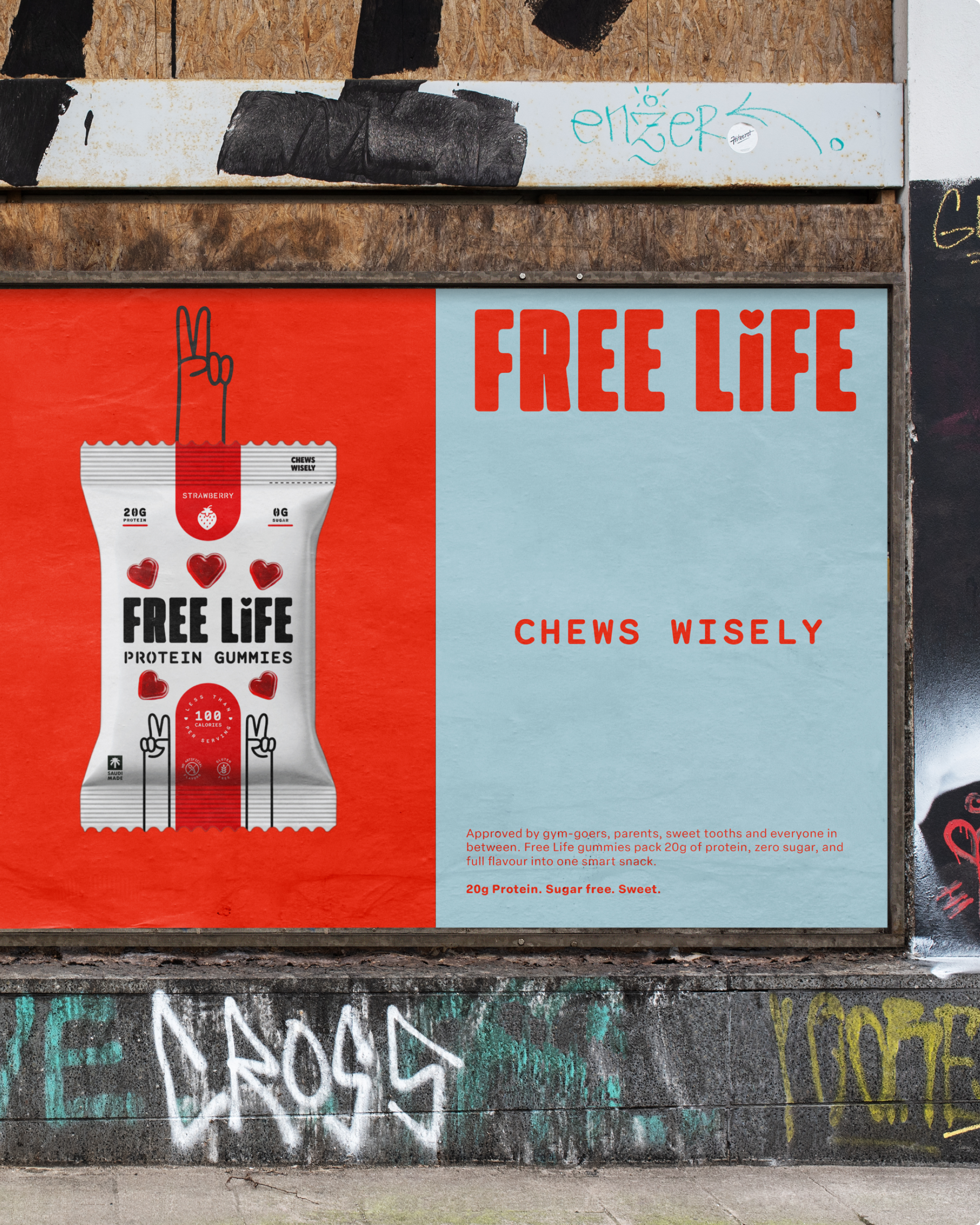
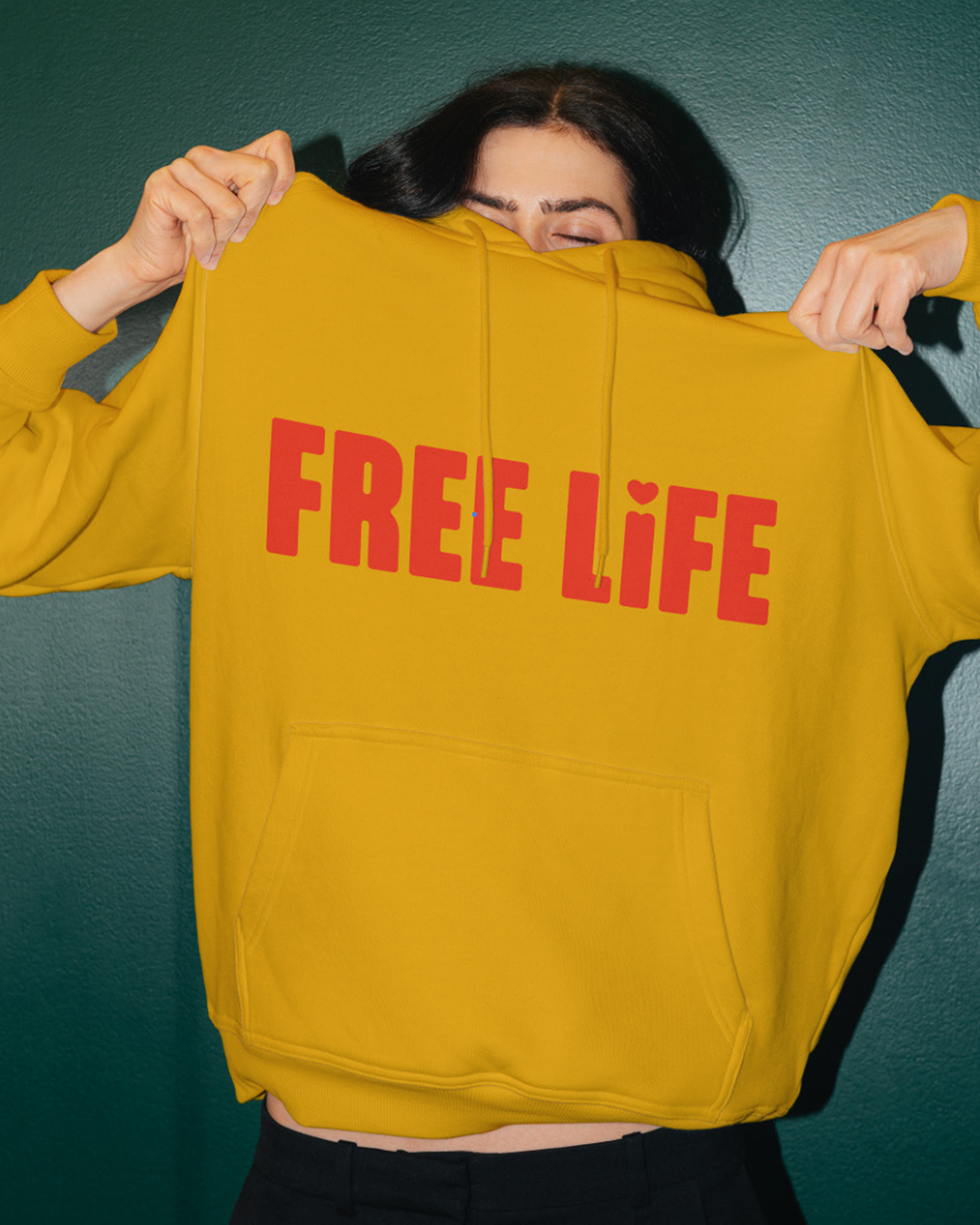
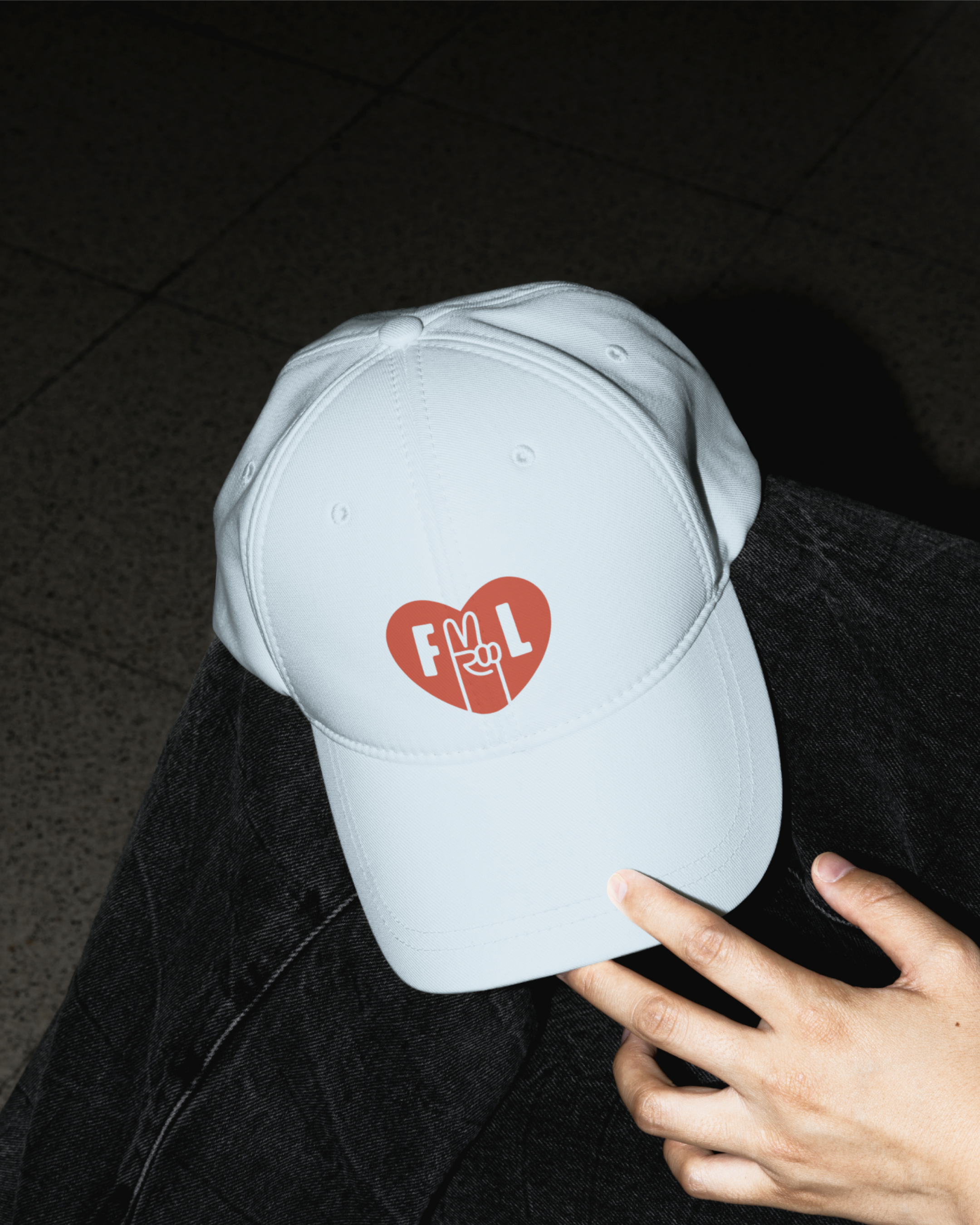
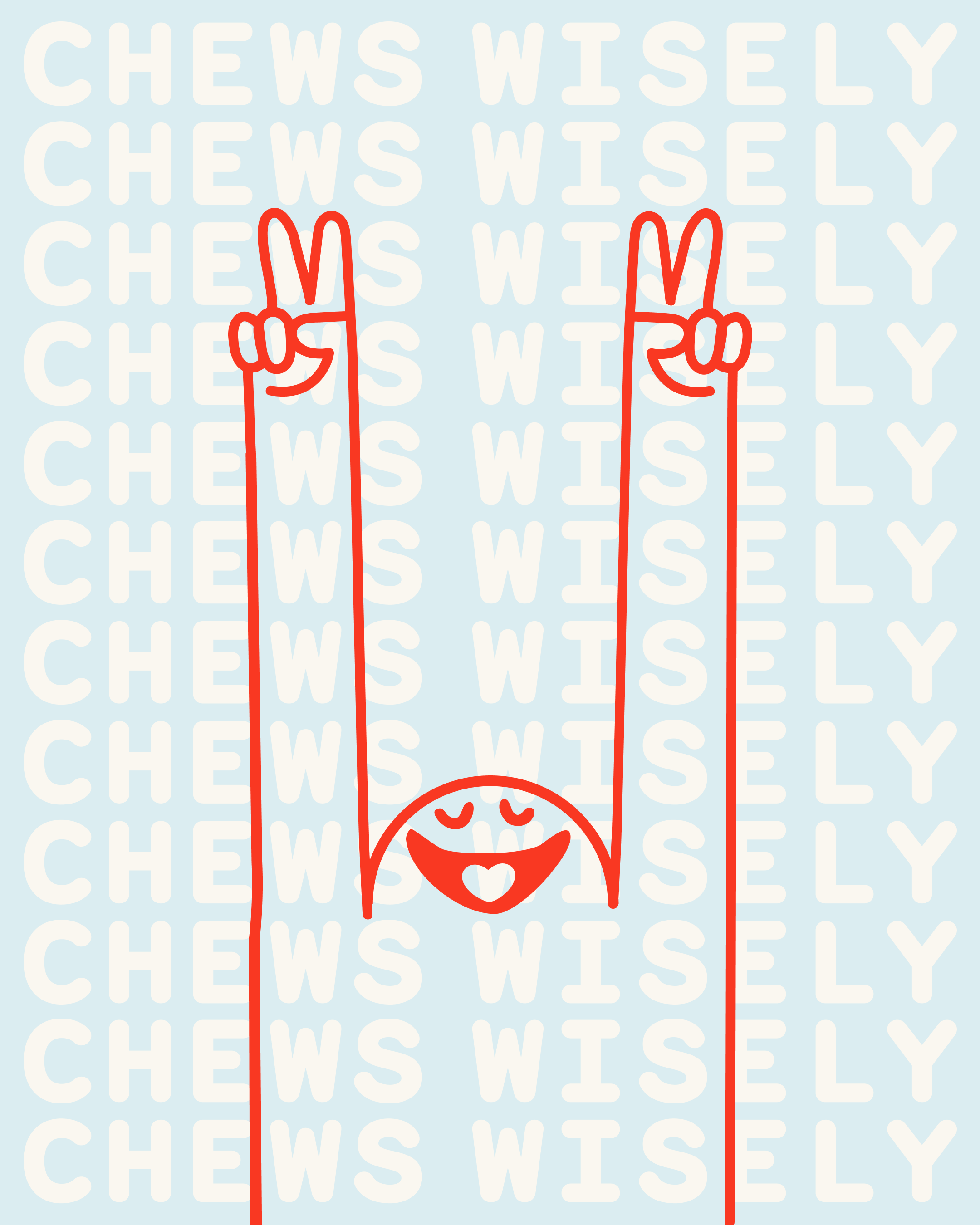
A new logo, new packaging and a whole new attitude gave FreeLife the personality and shelf presence the products deserved.
The revolution will be pocket sized.